Category
Branding, Illustration, Non-profitSustainable Harvest International
Brand Style Guide and web illustrations
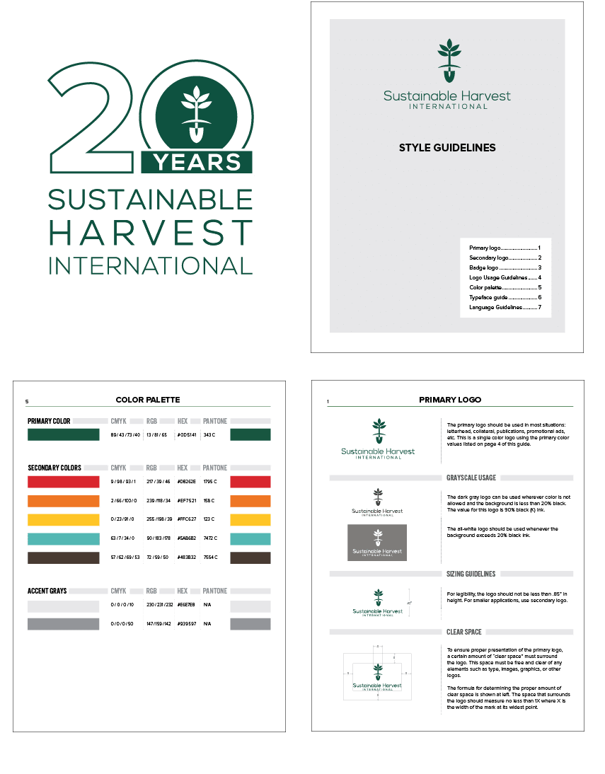
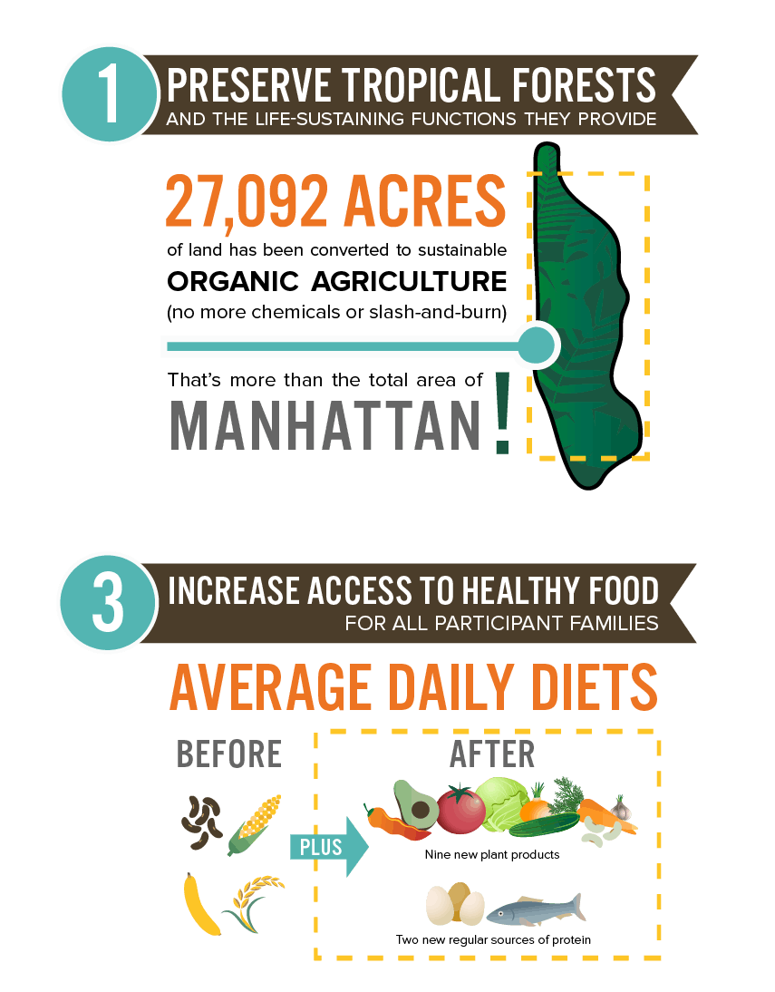
Sustainable Harvest International seeks to protect the environment by partnering with Central American families to build sustainable farming practices. When SHI rebranded in 2014, they had a variety of logos ready to choose from, but they needed some professional help in deciding which logos to use and when to use them. They also needed to establish a brand style guide to provide visual consistency across platforms. We came on board to give their rebrand a solid visual framework. Since then, we have provided SHI with several custom information illustrations, as well as their 20th Anniversary logo.
Have a project in mind? Call or email us to see how we can help.


